
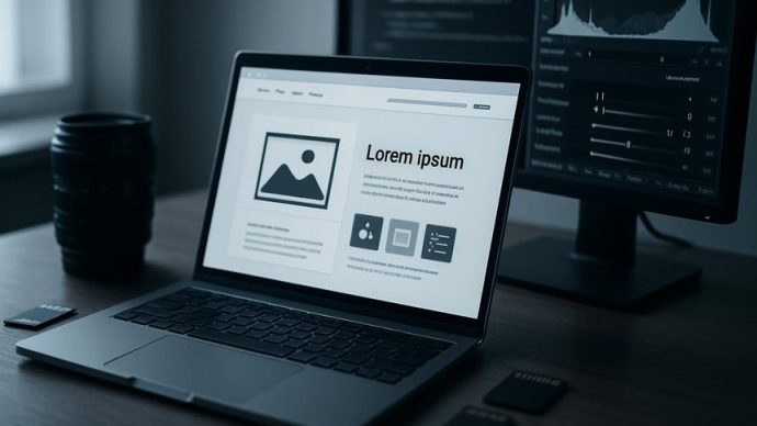
Think of images as the silent ambassadors of your site, carrying weight and first impressions. You’ll want to serve the right size with srcset, use WebP/AVIF with fallbacks, and choose lossy or lossless compression where it matters. Add lazy loading, concise alt text, and social-friendly crops to boost speed and discoverability. Keep going — the next steps will show how to automate these choices and measure real SEO gains.
Serve the Right Image Size With Srcset
When you provide multiple image sources with the srcset attribute, the browser picks the best one for the user’s screen and resolution. This means mobile visitors get smaller files while high-DPI displays receive sharper images.
You should define appropriate image sizes and variants so the browser can choose without extra logic; that yields optimized images and smaller image file sizes for mobile devices, cutting data use. That reduction improves loading times and helps Core Web Essentials, particularly Largest Contentful Paint (LCP), because the correct image arrives faster.
Modern browsers handle selection automatically, boosting performance metrics without JavaScript. Faster pages mean better user experience and can positively affect search engine rankings, so using the srcset attribute is an efficient, low-effort way to serve right-sized images.
Serve WebP/AVIF Safely (Fallbacks and Negotiation)
After you’ve set up srcset to deliver the right dimensions, you’ll want to serve modern formats like WebP or AVIF to shrink file sizes further and speed up pages.
You should test browser capabilities and use the picture element to provide WebP/AVIF sources with fallback formats like JPEG or PNG so older browsers still get images.
Configure server-side negotiation where possible so requests receive the best image formats automatically, improving page load speed and SEO.
Use image optimization tools to generate variants and automate conversions, and run A/B tests to quantify gains — studies show significant load-time reductions.
That strategy delivers superior compression without breaking user experience, ensuring visitors always see a compatible image.
Choose Compression: When to Use Lossy vs Lossless
If you’re aiming to balance quality and speed, pick lossy compression for photographs and rich visuals and reserve lossless for graphics that need crisp edges, text, or transparency.
You’ll use image compression to cut file sizes and boost page load speeds while protecting visual quality where it matters.
Lossy compression removes some data to shrink files 30–70%, ideal for photos; lossless compression preserves every pixel, trimming 10–50%, best for logos, screenshots, and transparency.
Choose based on context and monitor engagement metrics to see effects on user experience and SEO rankings.
- Use lossy for photos to create optimized images with smaller file sizes.
- Use lossless for text, icons, and transparent assets.
- Test trade-offs in web design and measure page speed and engagement.
Optimize Images for Social and Mobile (Sizes, Cropping, Touch)
Because social platforms and mobile screens vary so much, you should tailor image sizes, crops, and touch targets to each context to keep visuals clear and interactions reliable.
Use platform-specific social media dimensions (for example, 1200×630 for Facebook links and 1080×1080 for Instagram) so optimized images display without awkward cuts.
Apply intelligent cropping to keep faces and focal points visible — that can boost engagement rates substantially.
Prioritize mobile optimization by serving appropriately sized files via responsive design and ensuring touch-friendly dimensions (minimum 44×44 px for tappable images) to reduce accidental taps.
Track performance metrics to compare formats and placements; optimized images that match device and platform needs raise user experience and can drive far higher engagement.
SEO for Images: Filenames, Alt Text, and Schema
When you name, describe, and mark up images correctly, search engines and users both understand them better and your pages rank and convert more effectively.
Use descriptive filenames that are keyword-rich (e.g., organic-gardening-tools-raised-bed.jpg) so image SEO helps discoverability. Write concise alt text (under 125 characters) to boost accessibility and let search engines index images accurately.
Add structured data for product photos or recipes to give search engines extra context and improve click-through rates. Create an image sitemap so Google can find and index visual content faster.
- Use descriptive filenames and keyword-rich alt text.
- Implement structured data and image sitemap entries.
- Keep optimized images that support Core Web importance and accessibility.
Improve Perceived Speed: Lazy Loading, Preloading, Critical Images
Although images make pages attractive, they can also slow perceived load times, so prioritize which visuals load immediately and which can wait.
You should use lazy loading to defer off-screen images, reducing initial payload and improving perceived speed so users see useful content faster.
Preloading critical images like hero visuals guarantees they render early, lowering Largest Contentful Paint (LCP) and smoothing user experience.
Combine strategies: mark critical images for preload and lazy load lower-priority assets.
That focused image optimization helps Core Web Essentials and can reduce bounce rates as pages feel snappier.
Better metrics mean improved SEO rankings, since search engines favor fast, engaging sites.
Apply these tactics selectively to balance speed, fidelity, and engagement.
Automate Image Pipelines and Measure Impact (LCP, CLS, Engagement)
If you want consistent, fast image delivery at scale, automate your image pipeline so conversions, responsive resizing, intelligent cropping, and CDN distribution happen without manual steps.
Automate image pipelines to cut response times like Chronext did and integrate tools into your CMS for faster publishing and fewer bottlenecks.
Use lazy loading techniques to defer offscreen images and improve initial load.
- Measure impact: track Largest Contentful Paint (LCP) and Cumulative Layout Shift (CLS) to evaluate image optimization against Core Web Essentials.
- Apply intelligent cropping and responsive resizing to prioritize key visual elements and boost engagement, following examples like Nikkei.
- Monitor engagement and iterate — combine image management, CDN delivery, and analytics to continuously improve UX and SEO.
Frequently Asked Questions
How Do Image CDNS Differ From Self-Hosted Image Pipelines?
They differ in setup, control, and scalability: you get managed resizing, caching, and global delivery with CDNs, while self-hosted pipelines give you full control and lower recurring cost but require more maintenance and infrastructure.
Can SVGS Be Optimized the Same Way as Raster Images?
Right off the bat: yes, you can optimize SVGs differently than rasters; you’ll minify, remove metadata, simplify paths, and use symbols or sprites; don’t reinvent the wheel—keep them lean and cacheable for fast rendering.
How Do Images Affect Core Web Vitals Beyond LCP and CLS?
They impact FID and cumulative input delays too: heavy images can block main thread during decoding, delay interactivity, increase JavaScript parsing time for lazy loaders, and cause network contention that slows resource fetching and user inputs.
What’s the Impact of Image Licensing on Optimization Workflows?
Licensing acts like a gatekeeper: it shapes how you store, compress, and serve images, because you’ll need to respect usage limits, attribution, CDN rules, and derivative restrictions, so your optimization workflow must include legal checks.
How to Handle User-Uploaded Images Securely and at Scale?
You should validate, sanitize, and virus-scan uploads, enforce size/type limits, store originals separately, generate resized/optimized variants via trusted services, use authenticated access and signed URLs, rate-limit uploads, and monitor logs for abuse.
Conclusion
You’ve got the tools to make images fast, beautiful, and discoverable — now use them. Serve the right size with srcset, fall back from AVIF/WebP, pick lossy or lossless wisely, and craft filenames, alt text, and schema that search engines actually read. Lazy-load and preload critical visuals, automate resizing and cropping, and track LCP and CLS. Like a well-tuned lens, these tweaks sharpen user experience and boost SEO — small changes, big focus.